
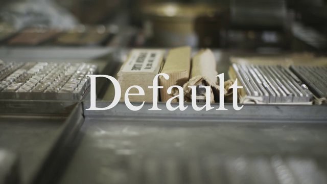
It is called classic, boring, proud and much more. Times New Roman is a font for the reader, not the designers. The London Times ised it for the first time October 3rd, 1932, and ever since, it has become the most recognizable in the world of typography. Graphic designers and printers talked about it in a youtube video, uploaded on the English newspaper’s account, a few days ago.
In 1931, after an article-criticism of Stanley Morisson on The Times layout, Victor Lardent created the Times New Roman and “made it (the newspaper) look, as good as it was”. It was also named after a play of words with the newspaper’s name. It was used for 40 years, until it was replaced for several reasons. In 2006, Times Modern was presented.
During the 3,5 minute video, multiple personal points of view and data about the Times New Roman are shown. Most of them are not using it, but can’t deny its importance for printing circles. “Whether you like it, or not, it can not be ignored”.


